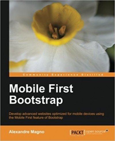
Mobile First Bootstrap
- نوع فایل : کتاب
- زبان : انگلیسی
- نویسنده : Alexandre Magno
- چاپ و سال / کشور: 2013
- تعداد صفحه : 92
- شابک / ISBN : 1783285796
Description
If you know the basics of Bootstrap this book will show you how to use it for websites that start from a mobile perspective. Create sites that are user-friendly for all mobile devices.
Overview
Get to grips with the essentials of mobile-first development with Bootstrap
Understand the entire process of building a mobile-first website with Bootstrap from scratch
Packed with screenshots that help guide you through how to build an appealing website from a mobile-first perspective with the help of a real-world example
In Detail
Bootstrap changes the way we develop websites in the frontend, and mobile web development has grown incredibly over the past few years. There are over 1.2 billion mobile web users in the world, and 25% of those mobile web users are exclusively mobile. Now, Bootstrap has also gone mobile-first. The mobile-first version of Bootstrap lets you first think about the mobile site and then think about how it expands to larger screens. To build websites for mobile devices that improve the overall experience of your customers, you need to be skilled at using the mobile-first feature of Bootstrap.
Mobile-first Bootstrap covers the new features in Bootstrap 3 and focuses on how they affect development from a mobile-first perspective. It will show you how to use Bootstrap 3 for developing websites for mobile and how to use that knowledge for your own development projects.
The book starts by highlighting the new changes that have been made to Bootstrap 3. After learning about these new features, you will discover how to easily build websites for mobile. You will learn how to run Bootstrap 3 Docs to customize Bootstrap for your needs. You will then be introduced to the new mobile grid system, the responsive utilities, and how to use mobile-first for navigation. Then, using JavaScript, you will explore the power of data attributes and progressive enhancement before starting to develop a web project from scratch. The last section of the book will discuss the main issues that affect the performance of Bootstrap as well as the issues that arise while dealing with responsive images.
Mobile-first Bootstrap guides you through everything you need to know about Bootstrap 3 and helps you to understand and use the mobile-first approach in your own projects with the help of an example project.
What you will learn from this book
Develop websites using the mobile-first approach
Use the new Bootstrap grid system
Develop a mobile-first website from scratch with the help of a practical example of a live website
Deal with responsive design performance issues
Use Bootstrap as a kick-start framework to develop your websites for mobile, tablets, and desktop
Learn the best design decisions to make your frontend scalable for any device


